
A new academy is an opportunity to build something from the ground up—and give it an identity that people remember.
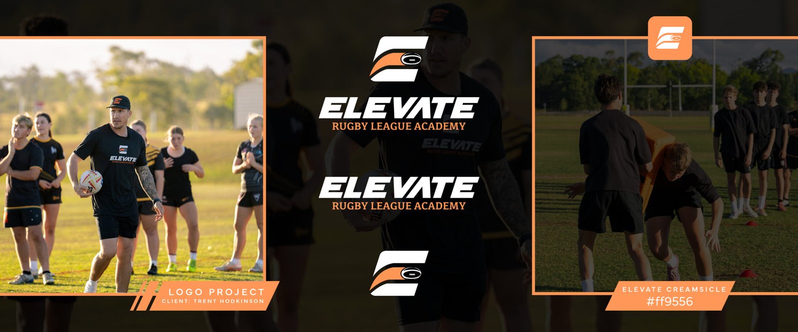
I recently had the pleasure of working with former NRL player Trent Hodkinson to create the logo for his new venture, Elevate Rugby League Academy. It was a great opportunity to bring my love of design and sport together, creating a distinctive look for his next chapter in rugby league.
The Design Direction
The Elevate name provided a strong starting point. It suggests progress, improvement and taking that next step—ideas that translate naturally into a sporting identity.
The finished design pairs bold, forward-leaning lettering with a custom symbol and a distinctive colour palette. It has a confident sporting feel, with enough simplicity to work across the different places an academy’s branding needs to appear.
Building Rugby League Into the Mark
At the centre of the identity is a stylised ‘E’ with a rugby league ball woven into its shape.
This brings the academy’s initial and its sport together in one recognisable symbol. The sweeping lines introduce movement, while the solid shapes give the mark a strong presence.
Paired with the Elevate wordmark and the Rugby League Academy descriptor, it forms the full logo. The ‘E’ also works independently, giving the academy a compact option for applications such as caps, social profile images and smaller placements.
That flexibility helps the branding stay consistent without needing to use the full logo every time.
A Custom Creamsicle Colour Palette
One of the defining features of the identity is its custom creamsicle orange, paired with black and white.
The orange brings warmth and energy to the design, while the black and white provide contrast and keep the lettering clear. Against dark training apparel, the colour gives the branding a distinctive presence.
The result is a palette with personality that carries through from the logo to the wider visual presentation of the academy.
From Design to the Training Field
One of the most rewarding parts of a logo project is seeing it leave the screen and become part of a real business.
Seeing the Elevate identity on Trent’s training gear, out on the field with players, brings the project to life. The full logo and standalone symbol each have a role to play, helping the academy present a cohesive look in action.
For me, that’s where thoughtful logo design earns its place: in the everyday settings where people see, wear and connect with a brand.
Thanks for trusting Troy Designs with this one, Trent. Proud to play a small part in your next chapter.
Starting Something New?
Whether you’re launching a sporting academy, opening a business or refreshing an established brand, a considered visual identity gives you a strong foundation to build on.
Get in touch with Troy Designs to talk about your next logo and branding project.

Leave a comment